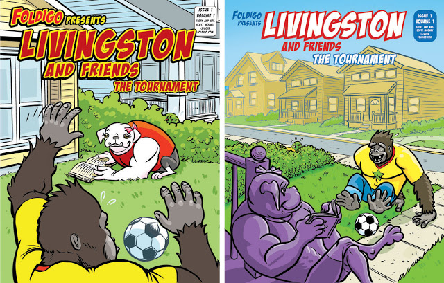
Foldigo Cover Re-Do
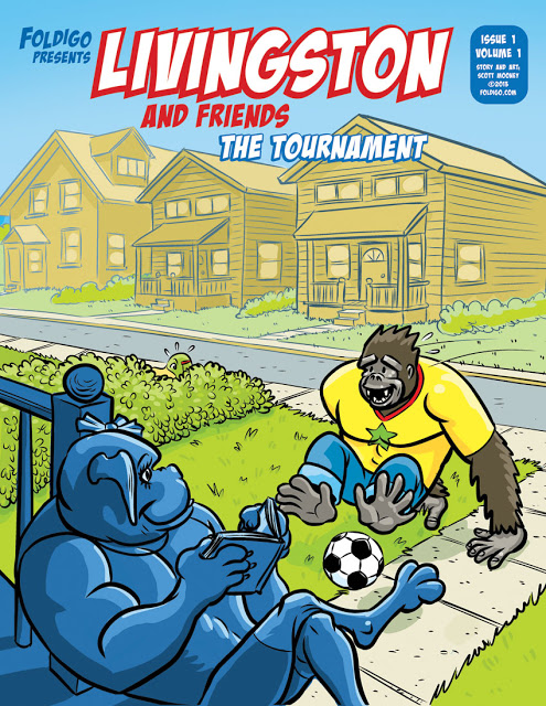
After 6 hours redesigning the cover for Livingston issue 1 I look at both versions side by side and wonder why I insisted on creating a completely new illustration. The old cover was too busy at the top, the titles were too hard to read, and Franchesca's house doesn't' match the pop-up version I created for the craft kit. The new cover has more free space at the top and simpler letters, and we get to see Livingston's excited face. So I think the new cover is a better solution.
Actually, The purple wasn't working for me. She's supposed to be in the shade of her front porch, not a grape Kool-aid ice sculpture :-)

