Number of Revisions Tells You Almost Nothing, Think "Process" Instead.

Health and safety leaders I’m helping design their employee education programs understandably want to know the process. They tend to think of it in terms of revisions. They want to know how many revisions they would get. But that doesn’t really tell you much about the process of getting the awesome result you’re after. The process below is a better answer that helps you gauge how you’ll get to your great results.

Home Depot Mexico, 2022, Award Winning Illustrated Training Program. Client and graphic design by Intertek Catalyst.

How many revisions do we get?

Ok, I will answer this question, sort of. The short answer is six revisions... though the word "revisions" doesn't quite capture the process. I use a workflow that practically eliminates the need for any expensive revisions, for my studio and for the client. I think of it more as stages of approval, rather than a number of revisions. You could think of each stage as a revision, but sometimes there are no revisions needed in a given stage. The further we get through the stages, the smaller the changes should be getting.

A revision is a completely new image. This is VERY easy to do in the concept thumbnail chicken scratches stage. It gets more costly to do the later in the stages you get, especially If we’ve finished the artwork already. At that stage, the revision costs a whole new illustration. This escalating cost of revisions really complicates the answer to the “How many revisions do we get?” question.

Graphic Design Note: If my studio is also managing the graphic design side (Layout of your entire page with text blocks and titles and graphic elements) the graphic design staged process would follow along more or less the same way I describe below. 

Approval and revision stages typically include:

  1. Concept Development Stage, AKA the concept Thumbnail Chicken Scratches Stage: Here we have a creative meeting together with your team to clarify the purpose and the results for each item and the technical requirements for size and format. At this stage, we can have lots of revisions easily. Clients generally don't need more than three revisions at this stage, but we could easily go to 5 or six if need be..., except that adds to the back-and-forth time in approvals. Anyway, that rarely happens.

  2. Concept Sketches, AKA Rough Roughs: Based on the above concepts I produce very rough concept sketches and send those to your team for review, approvals and changes. If any of these concepts are not working for you this is the best and most important stage to re-create or drastically modify the idea, so we give this stage careful consideration.

  3. Changes to the Concept Sketches: I go back and develop new sketches for changes or total revisions to the concept and send you those for review, approval, or further changes.

  4. Tight Pencils: I produce more detailed resolved drawings for you to review to make sure I have the details properly depicted. Look for details like what kind of equipment is used, uniform accuracy, terminology and generally having things look convincingly like your company's environment. 

  5. Ink and Colour: I produce finished-looking illustrations for your team to review. We look for colours that need or want changing, facial expressions, cultural detail, and equipment detail. 

  6. Final Art Stage: My studio makes a final pass on the artwork, tweaking the art if we can see something we want to improve, applying any of those detail change requests you've asked for, and making sure the work looks great and communicates clearly.

VERY rarely do we need a revision at the final art stage. By the time we’ve gotten there, the artwork has undergone a LOT of scrutiny. One or two times in my time using this process have I had to do a complete revision at the end. And that was because the training program content changed after we’d already finished the artwork. And even here it was just one of the 6 posters. That is no longer a revision. That’s a whole new poster. An addition to the original order.

The moral of the story: Ask not for the number of revisions. Ask for a process that produces your strong concept at the beginning when it’s very easy to make changes. This way you can stay on both your time and financial budget, and get great work that meets your needs.

Is AI Going to Hurt My Illustration Business?

A friend asked me if I was worried about AI taking over my job. I told him this:

The thing about AI art is it still takes a skilled person with good aesthetic and communication skills to produce it. And to cause it to produce exactly what my clients need from it would take as much time as just drawing it. In fact, I do use AI as a tool to produce my work, but instead of making my work faster it just makes it better. I don't use the direct results of the AI work as a stand-alone image. I use it to create parts of the image I'm custom building, or to generate ideas, colour palets, etc. But mastering the prompting and iteration process to make a very clear and specific communication piece is not easier than drawing it.  Unless, of course, the AI artist doesn't actually know how to draw, in which case the AI is their only option and they're stuck with it.

I suspect it will be similar to the dawn of affordable digital cameras, where amateurs could access the technology and suddenly decided they wanted to quit their jobs to be photographers. Then they discover that being a successful photographer is about a lot more than owning a camera and having some talent. Most of those people dropped out of their photography fantasy careers due to the challenges of running a business, and the fact that they were competing against a bunch of real pros who also had great tech, plus a lot of other expertise that goes into it.

Choosing your Pencils for Sketching

The way I do my illustration practice, good ol' HB pencil is my main non-digital sketching tool. For me, pencil sketches are done for studies, planning and underdrawings.

2B is really good for life drawing, especially if you're drawing on larger paper because it goes a bit darker and wears down to a thicker line more quickly. It makes a more visible line and it's still hard enough to work with cleanly... not too smudgy. It's really great for life drawing in a larger sketchbook, say 8.5x11 or up to 11x14.

If he's drawing really big, Charcoal or Black chalk are great options for life drawing.  A pencil line will be too small to see well on a big page... maybe handy for getting into small details on that big page, in which case a very soft pencil would be able to go dark enough to show up with all that black charcoal.

As far as lead hardness goes: the softer you go the blacker (B) it gets, and the smudgier and messier it gets, and the harder (H) you go the lighter and more difficult it is to see. HB is the middle of the range (It's Hard and Black in balance) and 2B (the next or 2nd level of Black) also gives you a lot of tonal range to work with.  

Sometimes I use blue-pencil, which is a comic book artist's or illustrator's tool for making drawings that are meant to be inked over. It's pretty cool to use because it changes my approach to drawing. It forces an artist to draw lightly. It's often tempting to go too dark too soon, but the blue pencil can't go dark, so it teaches us to change our approach. And even though it's very light, it's also easy to see because the blue hue adds a visual intensity to the line...stimulates the colour receptors in our eye.

Multi-Modal Learning

I used to tell people that 66% of the population are visual learners, and that’s why they should hire me to illustrate their educational materials. Recently I saw a video that studies and debunks that “learning styles” theory. The conclusion of that video says that we are all multi-modal learners. That means we learn best when the teaching tools match the task, and when multiple modes of conveying the knowledge are used.

Visual art covers at least two of those multiple modes of teaching, because it’s both visual, and it conveys a story. People’s brains are well attuned to remember stories so a visual story gives you a double whammy.

And if you go with comics as a teaching medium, you’re hitting the reading comprehension mode too, giving you a triple whammy in one item.

Here’s the link to that video: https://youtu.be/rhgwIhB58PA

Drawing Homework: Sketchbook Series

If you’re learning to draw (or paint, sculpt, etc), one of the most powerful things you can do to learn is to watch a skilled artist do it, and try out the stuff you see them doing. This will drastically accelerate your learning curve well beyond what you will learn just from understanding principles and practicing on your own with trial and error.

Ok, learning to draw is ALL trial and error. But watching people do it accelerates what you can do with your trial and error learning process.

Disney+ has a series called Sketchbook and I've started assigning my students to study this series. Each episode is 20 minutes long, featuring a different Disney animator telling their story of how they got into animation while demonstrating how to draw a specific character.

If you have access to this channel, You can do the same homework I've just started assigning:

Homework:

Watch 3 or more episodes and follow the drawing lesson given by each animator. The most important one I’d like you to watch is Episode 5, Mirabel. Other than that, you choose which ones you’d like to learn from. Follow along with the lesson and draw the same character doing the same thing that they are demonstrating.

Here’s the trailer for the series: https://youtu.be/P8stiIE-8oI

The purpose of this homework is twofold. One is to help you learn how they structure their work, how they hold their pencil, how they move their bodies while they draw, how they plan out what they are going to do. The second purpose is for you to hear their stories on how they made their way to this career. Each one has a different approach.

Drawing is more than a visual thing. It’s physical. Whole body movement, breathing, and even varying degrees of mimicking the character’s body language, facial expressions, and their feelings while you’re drawing them. Tuning into the energy of the scene.

I'd love to know how that lesson went for you. Feel free to send me your thoughts and drawings in the comments. And check out my YouTube channel or follow me on insta, FB or Linkedin to see speed paintings and the various ways that illustration gets created and used as powerful communication and education tools.

See more on my site at www.moon-man.com.

Follow me on social media:

Linkedin: https://www.linkedin.com/in/scottmooneyillustration/

YouTube: https://www.youtube.com/channel/UCd-0bdxQ-QgmWFgYGSw1UYw

Instagram: https://www.instagram.com/moonmanillustrations/

Facebook: https://www.facebook.com/scottmoonman

Twitter: https://twitter.com/scott_mooney

Tell your friends!:-D

Formal-Education or Self-Education?

Something I want my art students to know: What's more important, formal education or self-education?

Firstly, consider that formal education IS self-education... hold it as such and you will get more out of it. Go into it with a good reason... not just to have the formal certification. The paper (or digital) certification is not the only thing that gets you there. Who you become and what results you can bring to the table are super important.

That being said, self-education is essential to success. It's a bit of a misnomer really, because self education is still about learning from other people.

Self-education lacks the built-in accountability that formal education has so if you're struggling to make good progress put things in place that cause you to follow through; an accountability group, a peer group that pushes each other to grow or some sort of mentorship. Take on a leadership position somewhere, volunteer, start a job or venture that will push you to gain the qualities you want to develop in yourself.

Formal education teaches very little about how to succeed with the skills you're learning there. You have to make success important to you and educate yourself relentlessly. When I graduated I thought the universe would just drop success in my lap because I had a degree and was good at my craft. It didn't. Self education is the best way to learn

Get clear on why to do your work, pursuit, education, vocation, or goal. Without a defined "why" it's easy to fall into aimless wandering around through your career or life. If your "why" is to explore and learn a lot of different things then wandering all over the place might be a really good goal. It depends on what is important to you.

Have lots of conversations with skilled and successful people, keep training, keep adapting.

Keep stepping over the edge of your comfort zone. Otherwise your comfort zone starts to shrink rather than expand.

Another thing largely missing from formal education is leadership skills. If you are working in any position on a team or organization your leadership skills or lack thereof have a direct effect on the quality that you and your team and your organization can create. Leadership is not about being the boss. It's about stepping up to make things better for the people you affect. You have an effect on the culture of your team, household, class, or workplace no matter what you do so you may as well be intentional about it and lead the change you want to see. Embody the qualities you want, speak up, step beyond your job description. Give what you want to get.

School doesn't know what you want. It doesn't know what bliss you are following, or who you want to become, or what is important to you. You have to lead your education. You have to develop your own adapting program throughout your ever-changing life and lead it to gain the specific qualities, connections and certifications that make the path to where you want to go.

Funny, You Don't Look Autistic, Review/Blatant Promotion

Funny, You Don't Look Autistic.  The book is a comedian’s guide to life on the spectrum. I just finished listening to the audiobook version, written and narrated by Michael McCreary, a young, Toronto-based comedian/autism advocate.  It’s about his journey in life with his own Autism Spectrum Disorder (ASD), different ways ASD manifests in different people. The book is funny, and it’s an educational piece written for autistic and neurotypical readers alike.  It taught me a lot about how to understand and relate with the autistic people in my life.  

At least one percent of us humans have ASD... that's a lot of people!  If you don't think you know someone with ASD, you're probably wrong and this book will help you be a better friend to the ASD folks in your life.  And if you have ASD, the book has a lot of relatable stories, tips, and resources, and you'll get way more of the humour than I did!

Michael McCreary has a facebook page and a twitter feed, both searchable with @aspiecomic.  He tours around doing events and standup comedy.  

Advice for Artists Starting Out

“I am leaving to pursue my own career in art! If you have any tips for an artist starting out, please share!” This came in an email from an art director I’ve been working with recently. Replying to this was a great opportunity to remind myself of some important principles that support me in my illustration career. Here’s what I told her… and me… in reply:

The first bit of advice I would give is to really treat your art career as a business.  Make contacts. Learn from other successful artists, be a strong leader, manage your money well, use good equipment, master your art form.  Constantly develop and improve your systems for admin, sales, shipping, production, etc.  Anything you have to do a lot of is worth automating as much as possible, like invoicing, contracts, client education.

Think big... take on large projects.  It takes almost as much time to sell and administer a small project as to do the same with large ones, so you save a lot of time there.  And grow your leadership so that you can grow your business.  Those large projects might require help of all kinds.  I often hire other artists and designers to help meet demand or do things I don't have adequate skill in, like graphic design or animation or accounting.  I'll probably want an admin assistant eventually too.

I know a very successful glassblower who is an excellent designer, and he and his spouse grew his talent into a large multinational business with several highly skilled glassblowers on staff who he'd arranged to import from Eastern Europe, managed their visas and housing to make it easier for them to take the job, hired a manager who spoke their language to help lead them, and had a large warehouse on-site to hold his inventory, with an admin and sales staff too.  His business also served his community by hiring some at-risk people and working with them to develop their skills and success in the business.  All in a beautiful small town he loved.  That's an artist who thought big.

Learn from others, and also trust yourself.  Your unique approach to your work will be what interests your audience and buyers.  It's fine to change your style or have more than one.  Whatever you do will be coming through your unique way of being.  You don't have to do anything difficult to have a unique approach unless you have a challenge with second-guessing yourself... then the hard part is being unsure but trusting yourself anyway.  In your art but also your choices around other things, like your business model, your leadership style.  Let your ego fuel your success, it's a powerful driver but put it aside in your relationships with the people you serve, and the people you lead... and anyone else you care about.  Take care of yourself, and lift others up. 

You don't want everyone to love your work, that is a futile endeavor.  You'll be more successful with serving niche groups of special fans who love what you're about because you are sharing yourself with them and relating with them together as a sort of community.  If everyone likes your work you're probably making it too generic, which will be boring for you and won't really make a strong brand for you. Put yourself out there and if you have haters, celebrate that, because that means you're doing something special and bold.  People don't buy high quantities of things they just like, but they will invest in things that they really connect with.  I heard one quote recently that said, "Don't listen to the critics... don't even ignore them".  Find your people and serve them with all your heart.

Whiteboard Video Gently Summarizes White Fragility

The Black Lives Matter movement is opening up a lot of great conversations about our cultures' conditionings and behaviours around race, and these conversations are circulating widely on social media, making it easier than ever for people to educate themselves about how racial bias shows up in our culture.

These conversations must be had if we are going to heal racial inequity in our world and can become very uncomfortable for the people who must have them. This discomfort shows up for many white people whose racial biases have been pointed out, and for people of colour who could be putting themselves at various levels risk to try and point out or discuss racial bias.

The more I look into this the more I find that people of colour are asking white people like me to do our own research on the internet, rather than burden them with the task of tiptoeing around our white fragility in order to help us understand how our racial biases are functioning in our relationships.

So I listened to the audiobook version of Robin DiAngelo's book, White Fragility, which was great. It really helped me recognize my own white fragility and gave me tools to deal with my own racial biases. Those biases are there in me. I don't want them, but they are there, they are deep, and I want to retrain my body/mind system to minimize their damaging effects in my relationships.

The book is long and has a lot of great things in there I want to remember, and an audiobook is not so easy to scan back through for the salient points. Thankfully the RISE District YouTube channel has published this great whiteboard animation to efficiently explain this complex and emotionally loaded topic.

Here’s a direct link to the video on YouTube: https://youtu.be/CdFCRHhygHo

The topic of this explainer video is White Fragility, which directly refers to the emotional explosions or implosions many white people have when they feel their identity of being a good person is threatened by having someone point out some racial bias that's showing up in their assumptions or behaviours.

The brilliance of this video is that it makes the topic very clinical and unemotional in the way it presents concepts that could otherwise be inflammatory while making the visuals compelling and engaging and visually relevant so that the viewer's mind is receiving the information from a few different angles at the same time.

The characters are drawn as non-threatening ordinary-looking people. The filmmakers were careful to avoid making the characters into caricatures or stereotypes, striping any emotional judgement out of the tone of the video. This allows a very thorough and succinct summary of the White Fragility principles DiAngelo teaches to be told in a way that is very palatable and easy to receive.

This animated explainer video and others like it are excellent tools that allow people to educate themselves about racial bias and conditioning without stressing out the people of colour in their lives, and without having to navigate through the agitating flame wars that fill the internet when researching controversial topics. This is a great gift to our society, all made possible with the power of whiteboard animation and YouTube!

COVID-19 and Food Security

The COVID-19 pandemic interrupted the delicate balance of our food production and supply system, affecting global and local food security. Here’s an infographic I made with Evan Fraser, director of the Arrell Food Institute at the University of Guelph. You’ll see there are 2 versions. The original, designed as a long scrollable strip to be navigable on phones. And a conversion to a horizontal comic strip to accommodate a different publishing style.

COVID-19 Infographic VER11c COL.jpg
COVID-19 Infographic VER12b HOZ 1000.jpg

"For the love of God, Marie!" a review by Scott Mooney

Marie Cover.jpeg

Jade Sarson's Debut graphic novel "For the Love of God, Marie!" is a bold book about sex and love and the cultural opposition those things can bring about.  It’s a bold topic to take on, and Jade Sarson does so courageously. The book is skillfully crafted with great storytelling design and illustration. Paper colour and colour palettes are very carefully considered, signifying time, historical era, and the emotional states of the main characters.

Marie is a character who takes a stand for who she is, in spite of the painful rejections this brings about from people she loves deeply.  She has combined Jesus’s directive to love one another with her desire to nurture people through sex. It’s a maturation plot about how Marie comes to terms with who she is, and how she affects the people in her life over a 30-year time span. 

Spoiler Alert: I’m going to talk below here about story specifics and my interpretations thereof.

The main conflict of the story is love versus conformity. Marie loves many people and a big part of her expression of that love is through sex, regardless of gender or cultural identity. Meanwhile she is maturing through an era of massive cultural change and friction, living her childhood through the 60’s, teen years in the 70’s, parenthood in the 80’s and 90’s. Religious and racial and cultural prejudices (embodied in the reactions of her old guard British parents) are constantly challenged by Marie’s choices of lovers. 

Marie’s character embodies freedom of love in a few ways. Aside from the 60’s sexual revolution, Marie loves people unconditionally.  Her heart reaches out to people downtrodden by their culture, as she herself knows this pain. Her sexual behaviour is fairly taboo for her time,  with her mixture of same-sex and cross-cultural lovers. Ironically this beautiful trait of hers generates embarrassment, condemnation, and jealousy in the people she cares about.*

I’m particularly interested in the graphic elements Sarson uses to tell this story.

Paper colour in the book gradually shifts from a fairly dark amber to a crisp white towards the end of the book. To me it marks the passage of time through the story, using the tendency of book paper to turn more and more yellow-brown as it ages. I read it as a visceral symbol of how old a given part of the story is.

Colour palettes are strictly limited, and the palettes are changed from section to section. Generally any given section is limited to one or 2 colours plus black, and the colour of the paper, with one exception, the persistent use of gold (more on that later). The specifically limited colour choices seem to indicate major chapters in Marie’s life, not necessarily chapters in the book. 

Burgundy, a conflicted colour on the edge between red and purple, the colour of red wine, blood of Christ, starts the book in Catholic primary school, a maybe 10 year old Marie playing the pregnant Mary Mother of Christ in the school Christmas pageant, and witnessing an event afterwards that sets her off questioning the established interpretation of her family’s religious values about what love is supposed to look like.

Blues, purples and reds for her childhood and teens in the 1960’s. Purple often symbolizes mixed feelings, inner conflict, sexual repression. It’s the blend of a hot and cool colour… fire and water.

Brown and yellow-green represent the time span of Marie raising her child Annie in the 1970’s. I clearly remember the brown and yellow theme in fashion and decor from when I was a kid in the late 70’s. 

Red becomes the dominant colour starting with Annie’s first menstruation. As the colour of blood, red is the nearly universal symbol of emotional volatility, known to stimulate hunger, lust, fear and anger).

Turquoise tones, bluey-greens and greeny-blues, quite deliberately take over the red starting on Annie’s wedding day in the 1980’s.  Turquoise is a cooler colour known to stimulate calm and relaxation. Think of how you feel looking into the blue and turquoise waters of beautiful beaches around the world. Turquoises and Pinks were popular colour trends at the time depicted here, I suspect thanks to the Cuban Miami cultural wave that swept popular culture back then. Check out the colour palletes of some footage from the pop culture phenomena of the time including the popular TV series Miami Vice and the awesome hit band Miami Sound Machine with their colourful videos.

The colour gold is particularly important to note. The colour characterizes or highlights only 3 people in the whole book, Marie, Prannath, and their daughter Annie.

Firstly gold is attached to Marie. Her hair is consistently a halo of Gold. As we see throughout the book she suffers the slings and arrows of her culture in response to her particular outlook on love. She’s a holy saint as she takes a stand against all pressure for her expression of spiritual love.

Secondly, gold is attached to Prannath, the man Marie falls in love with in college, the man who’s heritage is in India, who’s religion is Hindu. The frames of his glasses are gold. The umbrella he shares with Marie is gold. Prannath also suffers the disapproval of his family for this relationship with a white Christain woman. He’s taking a stand for love too.

Thirdly, gold is attached to Annie, in her Walkman and headphones and later in other accessories, and also in the gold umbrella that the family shares.

For The Love Of God Marie 8.jpg

The golden umbrella is a great symbol in the story. For one thing, it seems to stand for Prannath’s and Marie’s shared values that love transcends their cultural barriers.  At first the umbrella is his, then he gives it to Marie, and in a playful game it becomes theirs together. Eventually the gold coloured umbrella also belongs to their daughter Annie. Gold is literally and figuratively the umbrella under which Prannath and Marie come together.

Gold starts to evolve into other places later in the book.

One is her dear lifelong friend, the crossdressing pan sexual, champion boxer, Will, who becomes a sort of life partner, roommate, caregiver, provider, protector, occasional lover. Perhaps he eventually develops into adopting a similar value, accepting himself and taking a stand for who he is, what love is to him. Perhaps he is fully family now, under the gold umbrella.

Gold shows up in a sound effect from a firecracker that sparks a minor crisis that somehow brings Marie’s life to a new state of grace. 

There is a nightmare sequence that recounts all the things Marie is judged for or judges herself for, or fears about herself. Golden slashes and shapes highlight these things, in a blackened and otherwise greyscale monochromatic dream world. The gold shapes look like dangerous things in this sequence, things that shame and cut and crush Marie. Perhaps its a moment where her virtues feel like sins to her.

Marie and Agnes, her newly rekindled relationship from high school, begin to turn gold together at the end of the book.

I haven’t spoiled the book for you. The power of this story is not in what happens, but in how Marie relates with the characters in the book, and how she overcomes her emotional and spiritual challenges.  I rooted for her from the beginning, and cared about the quality of her experiences, and enjoyed the artwork immensely.

The Retirement Gift

The Loveable Minister

The Loveable Minister

Back in the day when I made caricatures on real paper, I handed over the original artwork for this cartoon portrait to the client without scanning it to keep a digital version for my portfolio. Well, I came across the original blue pencil drawing I made and decided to ink it all over again so I could show you what a great retirement gift a caricature can be!

Of course, I don’t aim to make people look goofy in my caricatures.  My approach is to make images that posit an empowering interpretation of the people depicted. This beloved church minister was famous for riding his bike everywhere, reading lots of books, and delivering his sermons with a great sense of humour. The congregation commissioned this cartoon portrait as a retirement gift to honour his service to the community.

-- Scott Mooney


OSCIA Illustration

The Ontario Soil and Crop Improvement Association had me create the cutest map project I've done to date!

This little farm map shows all the environmentally friendly features that farmers can get funding to build on their farms.  Including wildlife corridors, Swallow houses, turtle nesting sites, hibernaculums (hibernaculi?), wild grass meadows, treed windbreakers and much much more!

I created this as vector art to make it super easy to adapt the illustration for later iterations.  Objects can easily be moved around on the map and magically stay in perspective!

Need a cute and super clear info map made? Now you know who to call on. Me!

Need a new website designed? Contact Ken.

Scott Mooney

scott@moon-man.com.

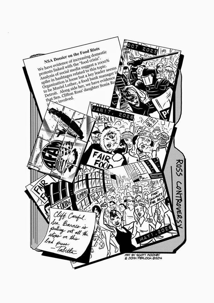
#foodcrisis: A Feeding 9 Billion Graphic Novel

The book is launched and live on

Lulu for sale as an e-book and as a paper graphic novel

!    

The cover art is all me.  The pages posted below are penciled by me, inked and lettered by the excellent John Perlock.  Thanks also to Rocco Commisso who penciled seven of the other pages in the book.   And the story is of course by Evan Fraser, special thanks to him for his vision and for bringing me onto the project.  

You might want to check out some of the Whiteboard Animation videos Evan and I did together with Director of Photography, Dave Woodside.  You can scroll down this blog to March 2014 for a few of them, or go to Evan's site at https://feedingninebillion.com/.  This book too is part of his Feeding nine Billion Project.  

AIDS Committee Guelph

Here's my homage to 1990's stock illustration.  You used to see a lot of strangely surreal yet cartoony paintings of faceless characters, usually in business suits, doing symbolic corporate stuff like climbing ladders, leaping over obstacles, and working together as a team.  The only thing missing from mine here is the business suit!


Actually, this was an experiment in Corel Painter trying to make generic figures in conversation for the AIDS Committee of Guelph (now being rebranded as ARCH"), for a booklet about challenges and solutions of a "Magnetic" relationship.  "Magnetic" is a term given to a couple where one person is HIV positive and the other is HIV negative.  What a great community service project!

Anyway, after way too many hours of experimenting in Painter (don't worry, I'm not charging by the hour!) I decided to finally take the advice of my client/art director and revert to my normal style of essentially clear line coloured comic art.  Ended up with this, which I think is much better for the project.  Nice and light and friendly. Way less generic but still simple enough faces to relate to a lot of people.


Whiteboard Animation: Feeding Nine Billion

I've been doing a lot of Whiteboard Animation lately.  I love this project, both as a great creative opportunity and because of how valuable this information is to the human species.  It's based on the extensive research of Evan Fraser, who is the driver and director of these videos.

You'll notice these are numbered videos 2 through 5 on YouTube.  Video 1 was done by my buddy Scott Chantler, who got too busy making comics to continue on this project... lucky for me.  Go read Scott Chantler's comics.  He's awesome.  No, wait... first watch these videos, then read MY comics, then read Scott Chantler's Comics. ;-)

Brought to you by http://www.feedingninebillion.com Illustration by Scott Mooney (www.moon-man.com) By 2050 there will be 9 billion people on the planet - but will there be enough food for everyone? Food security expert Dr Evan Fraser guides you through a whiteboard presentation of his solution to the Global Food Crisis.

Brought to you by http://www.feedingninebillion.com Illustration by Scott Mooney (www.moon-man.com) By 2050 there will be 9 billion people on the planet - but will there be enough food for everyone? Food security expert Dr Evan Fraser guides you through a whiteboard presentation of his solution to the Global Food Crisis.

Brought to you by http://www.feedingninebillion.com Illustration by Scott Mooney (www.moon-man.com) By 2050 there will be 9 billion people on the planet - but will there be enough food for everyone? Food security expert Dr Evan Fraser guides you through a whiteboard presentation of his solution to the Global Food Crisis.

Brought to you by http://www.feedingninebillion.com Illustration by Scott Mooney (www.moon-man.com) By 2050 there will be 9 billion people on the planet - but will there be enough food for everyone? Food security expert Dr Evan Fraser guides you through a whiteboard presentation of his solution to the Global Food Crisis focusing in this video on the role of the local food system.

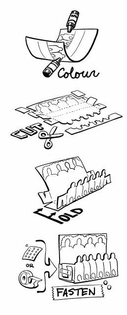
Instructions Comic Strip for Foldigo

Well I don't want to spoil the end of the Livingston and Friends "Tournament" Story for you all here, but oddly I'm as excited about how the instructions turned out as the foldable toy itself.  I'm a bit geeky that way, since I love instructional and educational comics.

Yes, our first series, Livingston and Friends; The Tournament, is complete and will be shipping in mere days! Just look at all the fun you can have!  There'a plenty of other cool stuff included in the monthly package. If you haven't yet, check us out at www.foldigo.com.