Watch Your Step!

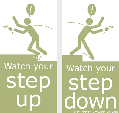
At our Photo business there is a single step between the main office and the photo studio.  Sometimes there is a wine and cheese event.  This is usually when someone fails to remember that this step exists.  We've cleaned up a fair bit of wine off the floors, walls, desks, pen holders, etc.  So we thought having me design this wayfinding signage would help.  So far so good!


As you can see they are designed to alert people from each side of the step.

Front Door Signage Design

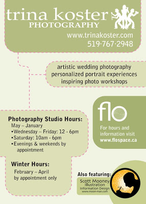
My wife and I have a photography business together.  At the front of the studio right beside the door we have a 2x3 foot sign with the pertinent info.  It was time for a redesign to update the info and improve readability.  I've been excited about flow charts and dotted lines lately so I used some of that visual language to tie together the related information.


You see, our studio actually houses 3 semi separate entities...

1) The photo studio.  This information is all connected by the pink dotted lines.

2) Flo (our shooting space is also a dance studio so we make it available for rent and we call that part of the studio "Flo").

3) Me.  My illustration, info design and graphic design services.  My illustration and design studio isn't literally in that space, but I often am and I get to have a bit of free promo out of the deal.  Hooray for free promo!

Game Map, Splinter Cell Cargo Ship Upper Deck

My guilty pleasure is video games.  I love figuring things out.  And I'm extremely patient.  Ubisoft's game "Tom Clancy's Splinter Cell" is a first person game requiring a lot of patience as you sneak around trying to avoid being detected by the guards.  This level takes place on a cargo ship.  To plan my strategy and keep from getting disoriented in the secret passageways at the beginning of the level I mapped the space.  Drawing this map was as much fun as playing the game!

Cervical Traction Exercises

My chiropractor sorely needed some good illustration to effectively communicate the correct usage of this traction device.  Words alone don't effectively show it, and a live demo is critical but it's easy to forget little details.  The illustration they were using before was very rudimentary and didn't really read very well and I thought it could use a second part to clarify some other information.  So I volunteered my illustrated information design services to make something really clear.  Ever see something that you know you could vastly improve and you just itch to fix it?  Well, that's what I did here.  They loved it.

"How to Edit Your Photos" Cheat Sheet

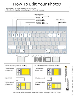
Photographer Trina Koster asked me to create an easy reference guide, laminated on a handy 8.5x11" card, so that her clients could use it to edit their own photos on Trina's photo management software.  This may look boring to most of you unless you use Aperture to manage your photos, in which case I'm sure you'll find it fascinating!  Oddly enough I found it totally fascinating to create this, because I get obsessive about developing the most effective information design possible.  I think it's the gamer in me.  I'm always trying to find the best, most effective way to accomplish something, or to communicate something.

Info Design Saves Many, Many Thousands of Lives, London, 1866.

One little bit of information design created in 1854 changed conventional thinking in a way that stopped the London cholera outbreak of 1866, saving hundreds of thousands of lives, and preventing any more outbreaks since.  Dr. John Snow and a minister named Henry Whitehead did a study and mapped their findings to prove Dr. Snow's hypothesis that Cholera was a waterborne disease.  As a result the government changed their policy and their communications to the public, sparing countless hundreds of thousands of lives by stopping the next outbreak and preventing any further outbreaks.

This little piece of information design is Dr. Snow's map indicating the number of deaths in proximity to a particular drinking water well on Broad Street (indicated with an X).  This "ghost map" was a key element, a linchpin, that finally convinced bureaucrats and doctors alike that cholera was spread via drinking water.  This bit of knowledge taught the Western world about the importance of sanitation in cities, which is what allows major cities to even exist at all today.  I learned about it from this great TED Talk by Steven Johnson.  Click here to check it out.  It's about 10 minutes long.

Elizabesque Hottie

I've always loved the pictures of beautiful women made by great concept artists and fantasy artists, so full of texture and costume design. I've always wanted to be able to draw like that but always ended up falling back on my cartoony habits. The cure? Quick drawings on toothy paper with a stumpy, blade-sharpened pencil. Added some tone and texture in photoshop with some cool brushes I found.

I also needed to let go of any concern about historical accuracy, so this outfit is just made up by my uneducated random ideas of what an ornate Elizabethan outfit might look like. History buffs can laugh and point all they want;-).

Yet another blotter Doodle

I've said it before... Some of my favorite pictures are the ones I draw as a way of blotting off excess ink from my brush three or four strokes at a time to test the consistency of the ink before comitting the brush to the real drawing I'm working on. Usually it ends up being a profile portrait of a made up character just like this. This one came off my brush last night as a side effect of inking two crisp and clean images for Paul and Layne Cutright's new course called "The Relationship Codes".

Drink and Draw Dec 2008


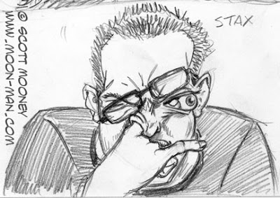
Here's a picture I drew with my left hand (I'm right handed) During last night's Drink and Draw gathering Michael Beyers put together at the Pennywhistle Pub in Guelph.

I drew this with a Bic pen (the kind you get at the store for $1.50 for a pack of 12) on some kind of decent bond paper, like printer paper, left over from a live caricature gig I did last year. I used to draw in Bic on bond all the time in high school... in the margins om my lecture notes. It's actually a really nice drawing tool because you can draw quite a range of light to dark with it.

Because of the glasses I thought this was looking a lot like Malcolm X... but I was drawing from my imagination and, upon photo research today discovered that the clothes do not make the man. My guy's face is quite different from the real Mr. X. So I just call this picture "Glasses Guy" now.

We had about 15 illustrators, cartoonists and artists show up. What was really cool about it is a) meeting and chilling out with a bunch of other illustrators and cartoonists and b) actually sitting down to draw whatever I feel like drawing! So many of us are so busy with drawing for clients and keeping up with life that we don't give ourselves the time to do the very thing that brought us into this career in the first place... which is having fun drawing stuff!

And that we did. We had a lot of laughs! You will likely find some hillarious cartoons from the event being posted someday soon on Michael's blog at http://www.michaelbyers.blogspot.com. If you haven't seen my illustration site yet, check out the comics section at www.moon-man.com. There's some neat stuff on there... if I do say so myself.

Cheers!
Scott

Kate Shutt, Orrin Evans, Musicians

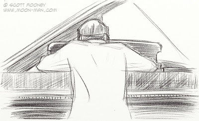
I keep forgetting how great it is to draw from life. I spend so much time cartooning out of my head. I had the privilege of being present at the recording of Kate Shutt's new album (it's going to be an amazing album!). I brought my modbook and made these drawings of piano player Orrin Evans (www.myspace.com/orrinevans). He was the only person I could see from the soundproof control booth. I wish I had made some drawings of Kate and the other musicians while I was there. Ran out of time and opportunity though. Maybe I'll be able to draw her another time. Here's her website: www.kateschutt.com


Modbook sketches

I've bought myself a Modbook. I'm the first person to buy one in Canada. I love it. What's a Modbook? It's a modified Macbook, the first mac tablet computer. So put me in the history books! This thing covers a lot of firsts... It's also my first mac!

Anyway, the reason I bought it is so that I could draw just like I do in an actual paper sketchbook. It's actually easier to draw with it than on my big 18" Wacom Cintiq because I can take it around, sit in front of people and draw from life directly into it! Awesome! It's the computer of my dreams... almost. If it had one of those monitors that you could see in daylight like oin the $100 laptop that would be even more dreamy.

So here are a couple of drawings I did on it... actual drawings from live subjects! Not just photos or made up out of my head! Neat!


Cheers!
Scott

Hulk Fan art in Painter

Okay, here's more Incredible Hulk fan art from me. (If you go far enough back in this blog you'll find a crossover fan piece about Hulk vs. American Elf). I drew the pencil for this one a year and a half a go at the Paradise Comicon in Toronto. I've been playing around with Corel Painter over the las couple of days, trying to get a feel for it. Decided to paint up this sketch and see what happens. I gotta say, I sure like what painter can do. I like how the Hulk looks kinda translucent and luminous here... a happy accident with the nice smooth oil paint feature.

I wonder if Marvel would ever like to have me do a Hulk Cover!!!

DJ Cartoons


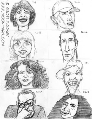
More drawings I like that would otherwise never be seen. I drew this series of caricatures for the Bob FM Radio station website and half way through the project the concept was canceled. These were based on photographs of the DJs emailed to me by the client.

Here's a close-up of my favorite one... my favorite for it's wacky Mad Magazine aesthetic ;-)